
Two Maps for Investors
Life in 2023 is complicated.
Despite us having more information, tools, and accessibility than ever, finding the facts is as difficult as it’s ever been. If you scroll social media you may find an article claiming something only to find fact checkers have labeled it ‘false’ or ‘missing context.’
Similarly, deciding how to invest is nearly impossible by doing a contextless search online. But the truth is: context is everything.
To illustrate this, let’s use a different kind of example. Let’s say you’re a hiker who wants to trek around Arizona. To be helpful, I give the below map as your guide.
The map gives great information, including distance between your destinations (via the legend in the upper left corner), the location of rivers and major cities, etc.
See for yourself:

You take the map, say “thank you,” and take off on your journey.
Yet, your appreciation for me —and this map— is short-lived.
In some parts of Arizona the elevation is as low as 70 feet above sea level (the Colorado River), while others are 12,633 feet above sea level (Humphrey’s Peak). Not all distances are created equal and the map I provided didn’t tell the story of how treacherous a path might be.
You need a better map to get a real sense of what you may encounter.
One more like this:

With the above map you’d be able to better plot your path while understanding the tradeoffs. You’d evaluate situations and say things like “This path is the shortest distance, but the terrain is treacherous” or “this path is longer but seems much safer.”
Two accurate maps of Arizona, yet two wildly different views of the state.
When considering our investment approach, it’s common for people to state things like, “The stock market averages 9-10%, so I’ll plan on that annual rate of return for my portfolio.” Let’s think about this in terms of our two maps.
The First Map
If you Google “compound interest calculator” the first listing you’ll see is from investor.gov. If you go to the calculator you’ll input some variables to arrive at an ending portfolio value.
Here’s an example of a hypothetical $500,000 investment at 8% rate of return for 20 years:

When you hit “Calculate” is spits out this beautiful illustration:

Take a look at that beautiful, frictionless graph. Wouldn’t that be great?
Unfortunately, this isn’t the way markets work.
If you want a gentle, upward-sloping graph you need to lower your return expectations significantly. If you want better growth potential you need to get ready for a rockier ride.
The Second Map
Since 1928, the average annual price return for the S&P 500 index has been about 7.7% and the average dividend yield tends to be between 1.6-2.1%. So why wouldn’t investors be wise to suggest their yearly returns (price growth plus dividends) are going to be around 9-10%?
To answer this question we need to look at the map which shows the terrain. Here’s the relief map:

Data source: macrotrends.com. S&P 500 index price returns. Past performance not indicative of future performance. You cannot invest directly in an index. For educational purposes only.
The above table shows the annual price return of the S&P 500 (US Stock) index since 1928. Here is some cold, hard truth:
For the period in question, 30 out of 95 years saw negative returns.
The average annual return was 7.7%, but only three years came within 1% of that average figure (1959, 1968, 1993).
Only six years came within 2% of the annual average (1959, 1965, 1968, 1993, 2004, 2016).
The market posted annual returns greater than 20% on 26 occasions, the market posted 20% losses just 6 times.
What Can We Learn?
It’s human nature to seek out ways to reduce uncertainty — as investors, one of those uncertainty-reducing methods is to take long term averages and aim to apply them to our short term conditions. When we go into an investment approach with the expectation of making 9-10% and a year later we end up losing money, we often think our approach isn’t working or that we need to change something up. Rather than studying history to find that stocks have been negative for 30 of the last 95 years (and therefore acknowledging how normal it is for there to be a negative year), we then try to further reduce uncertainty by selling investments and going to something with a stable value (like cash). These reactions can be devastating events for a financial plan.
But it’s all normal: the feelings of uncertainty and disappointment and questioning your approach. All normal.
Calculators and projections are great, but they rarely do a good job at simulating the kind of mayhem we have to endure from the news, neighbors, family, etc. during our journey. My only suggestion is to start with the Second Map, because the First Map creates an expectation that your journey won’t have a Grand Canyon or Mogollon Rim or rivers and gorges and lakes to plan around.
That’s all for now.
Onward,
Adam Harding
CFP | Advisor | Smartvestor
https://www.hardingwealth.com/meet-with-us
One more thing about this map analogy:
If you want to get somewhere in the shortest distance possible, you might need to deal with unprecedented risk. Your chances of winning Powerball are 1 in 292 million for a HUGE potential gain. Your chances of winning blackjack are 42% for about a 100% potential gain. Your chances of winning as a stock market investor increase with time. Your chances of winning as a cash investor are basically 100% but the gain is minimal.
I saw this napkin sketch the other day which I think sums it up pretty well.
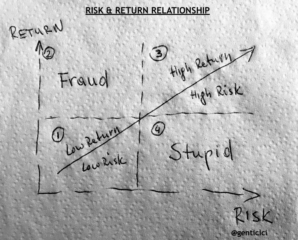
Source: Genti Cici (Twitter)